
Today, there are over 402.74 million terabytes of data daily worldwide. How do we manage such a considerable number? By leveraging data visualization. Businesses or individuals rely on these tools to explore, monitor, and explain insights within data. Did you know 65% of educators believe data visualization is critical for student engagement? Yet many struggle to find the tools that fit their classroom needs. The students’ spreadsheet data usually overwhelms the educators until they find the right tools to organize their data.
Introduction

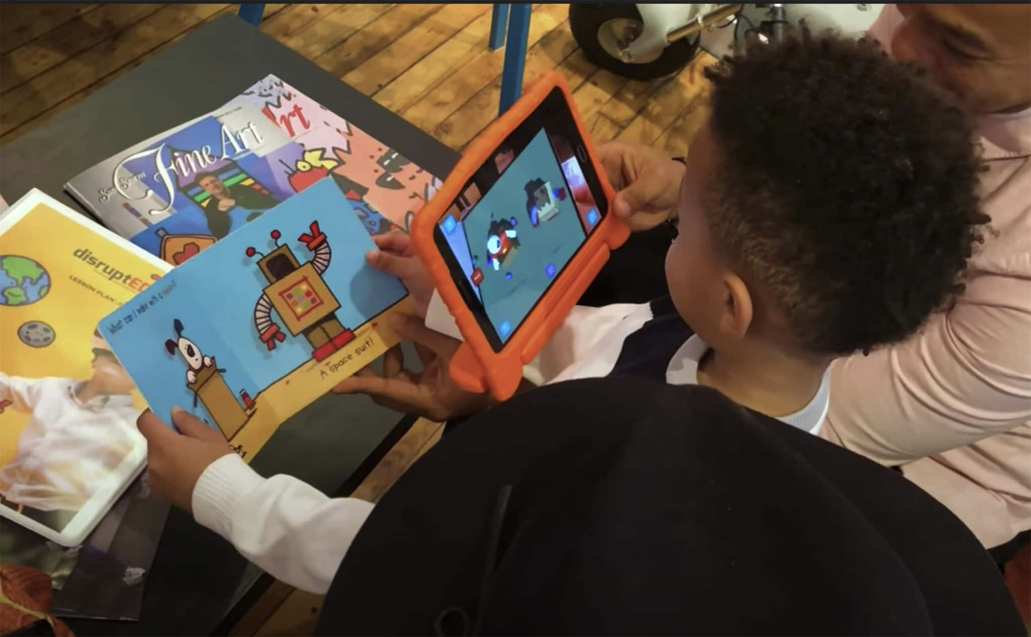
According to my friend, Dr. Matthews, a high school science teacher for over a decade, introduced an interactive chart to his students. Suddenly, class participation increased significantly, and they enjoyed data analysis. The right tools don’t just simplify information; they make learning more engaging.
In this guide, we will review the best data visualization tools. By the end of this article, you will understand the importance of data visualizations and how these tools help organize, sort, analyze, and interpret data.
Before I proceed, I haven’t properly defined data visualization. Data visualization is the graphical representation of information and data using standard graphs such as charts, plots, infographics, and animations.
Now let’s understand;
Why Data Visualization Matters
Let’s be real: traditional bar charts or pie charts rarely inspire excitement. Teachers have tight schedules, while students don’t require coding skills. The common challenges include:
- Time restrictions: students barely have the time to learn about complex software.
- Technical barriers: Students tend to get confused using formulas in spreadsheet packages such as Excel.
- Cost: Most tools are too expensive for the school budget.
Good news! You don’t need a huge budget or be tech-savvy to create outstanding visuals.
Let’s look at tools that work for the classroom. We have:
- Canva – for beginners
- Specialty: Quick infographics and presentations
- Why consider it: It has a simple drag-and-drop functionality.
- Cost: Free (Pro version for schools: $3/month).
2. Google Data Studio – for Interactive charts
- Specialty: Real-time data projects.
- Why consider it: It syncs with Google Sheets, perfect for tracking class participation or test results.
- Cost: Free
3. Tableau Public – For Advanced Analysis
- Specialty: High school/college projects.
- Why consider it: Free for students. A student once mapped global COVID trends and won a regional science fair!
- Cost: Free (with registration).
Comparison Table: Top Tools at a Glance
| Tool | Cost | Ease of Use | Specialty |
| Canva | Free/paid | ⭐⭐⭐⭐⭐ | Infographics |
| Google Data Studio | Free | ⭐⭐⭐⭐ | Real-time dashboards |
| Tableau Public | Free | ⭐⭐⭐ | Advanced projects |
Alternative tools you can use
| Tool | Type | Cost | Key Features |
| Microsoft Power BI | Dashboard platform | Free/paid | Drag-and-drop, real-time streaming, 100+ visuals |
| Microsoft Excel | Spreadsheet | Paid (Office) | Familiar interface, pivot charts, and conditional formatting |
| Google Charts | JS library | Free | HTML5/SVG charts, responsive design |
| GeoGebra | Math visualizer | Free | Real-time graphing, algebra integration |
| Desmos | Math tool | Free | Interactive sliders, classroom activities |
| ClioVis | Timeline creator | Free/Paid | Collaborative timelines, multimedia support |
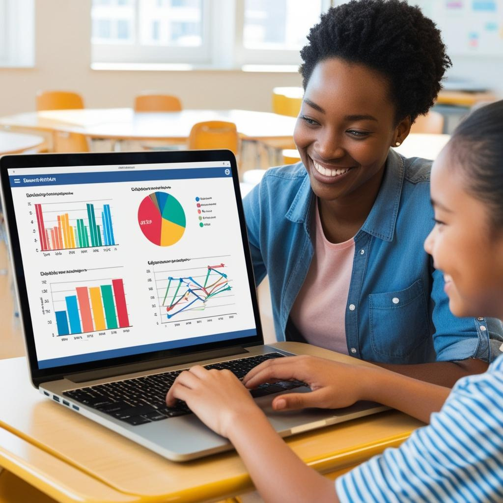
Case Study: How Ms. Rivera’s Class Boosted Engagement
How Ms. Romero’s Class Boosted Engagement
Marina Romero, a middle school math teacher, struggled to teach statistics until she tried Google Data Studio. Her students created dashboards with stunning visuals, and engagement soared by 50%.
Student retained 65% of visual information, compared with 10-20% of written or spoken information
After 3 hours, a student could retain 80% of the visual information, and 65% after 3 days. However, he could only remember 25-72% of the verbal or written information after 3 hours and 10-20% after 3 days.
Illustrated text is 83% more effective than text alone
A study of the above found that illustrated texts are 9% more effective when tested for immediate comprehension and 83% more effective when the tests were conducted after a delay.
Helpful tips
- Take Baby Steps: Using templates will significantly save time.
- Work together: Encourage teamwork in students by allowing them to review each other’s visuals.
- Acknowledge creativity: Celebrate the unique minds by hosting a “data art” showcase.